Graphs and charts
How to use graphs and charts
Video tutorials and webinars for Easy Redmine 11
Overview
Bar chart
Generic gauge
Line chart
Pie chart
Timeseries
Baseline on charts
Overview
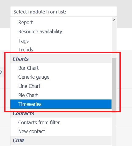
There are 5 basic types of charts: bar chart, generic gauge, line chart, pie chart, and timeseries. All of them might be added to any personalized dashboard. Just go to one and click the "Customise" button in the lower-left corner. Afterward, browse the list of modules to add and select the appropriate type of chart right from there. In addition to those charts as independent modules, there are also many other modules (such as attendance, earned values, CRM cases, spent time, money, etc.) which also can be configured to show data using one of the selectable types of charts.
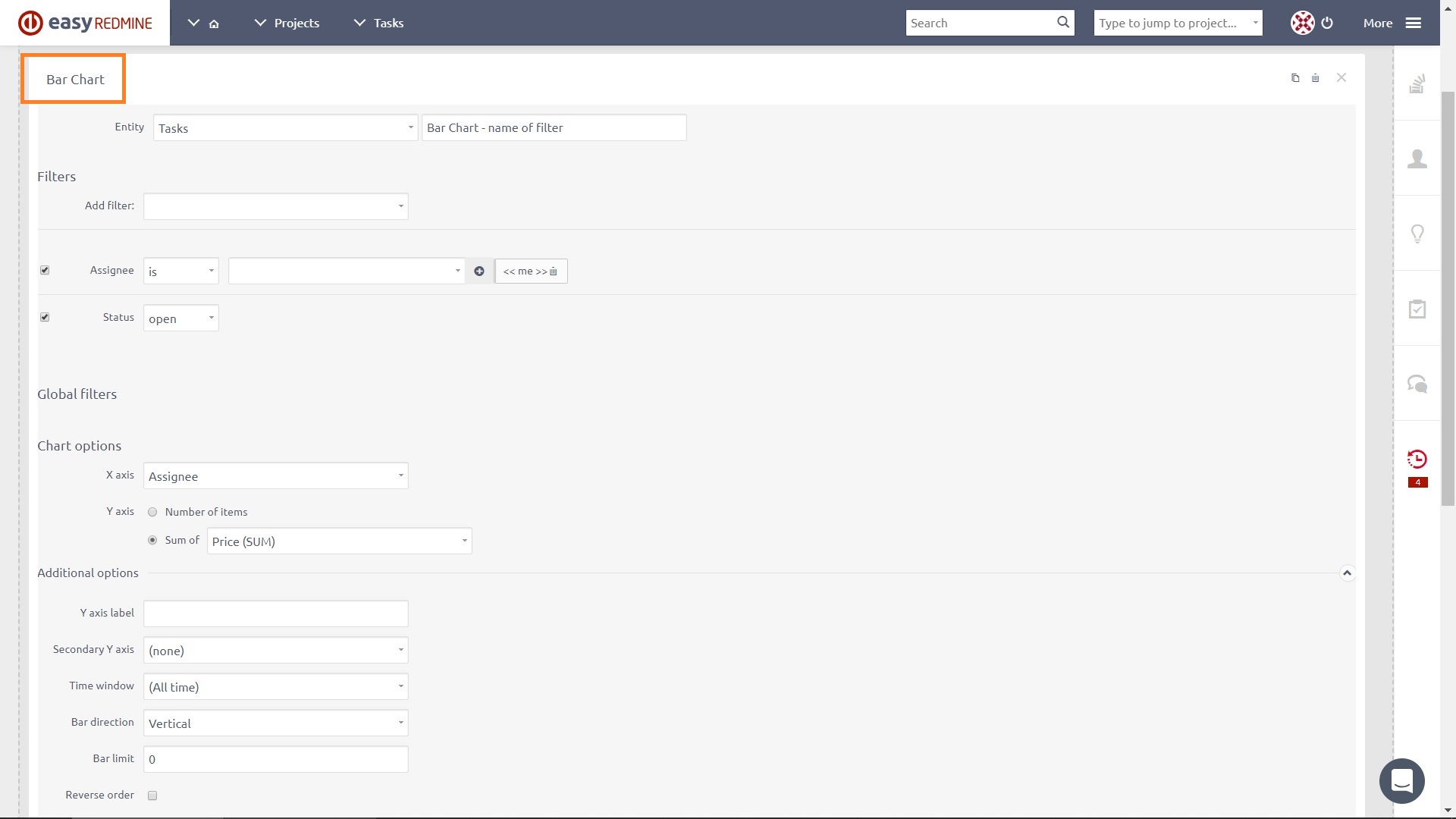
Bar chart
A bar chart a chart that presents categorical data with rectangular bars with heights or lengths proportional to the values that they represent. The bars can be plotted vertically or horizontally. A bar graph shows comparisons among discrete categories. One axis of the chart shows the specific categories being compared, and the other axis represents a measured value.
Setting options of Bar chart
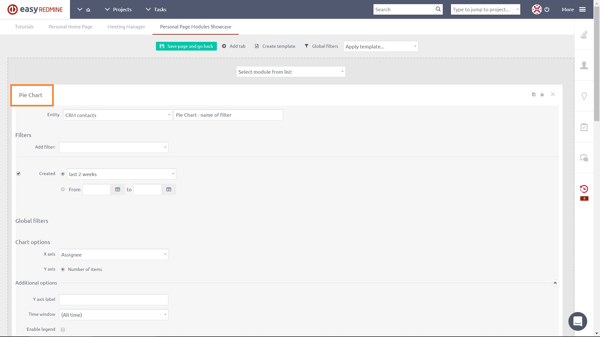
- Entity: Select the entity whose values you would like to see in the chart, such as Tasks, Users, CRM, etc. Also, give your chart a name.
- Filters: Optionally, select filters to reduce shown data to only specific values within the entity, such as "Assignee is me".
- Global filters: See Business dashboards
- Chart options: Define the data shown on the X axis and Y axis, including Additional options such as labels, time window, bar direction, bar limit, and order. After adding a secondary Y attribute, the user can choose whether the secondary Y axis should be shown, or whether only one Y axis will be used for both attributes.
- On click: See Business dashboards
- Caching: Optionally, select for how many days will the module be cached. Leave blank for defaults (1 day).
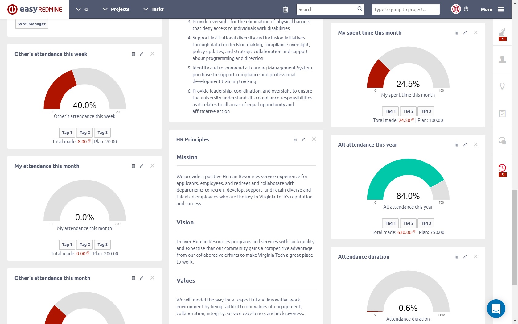
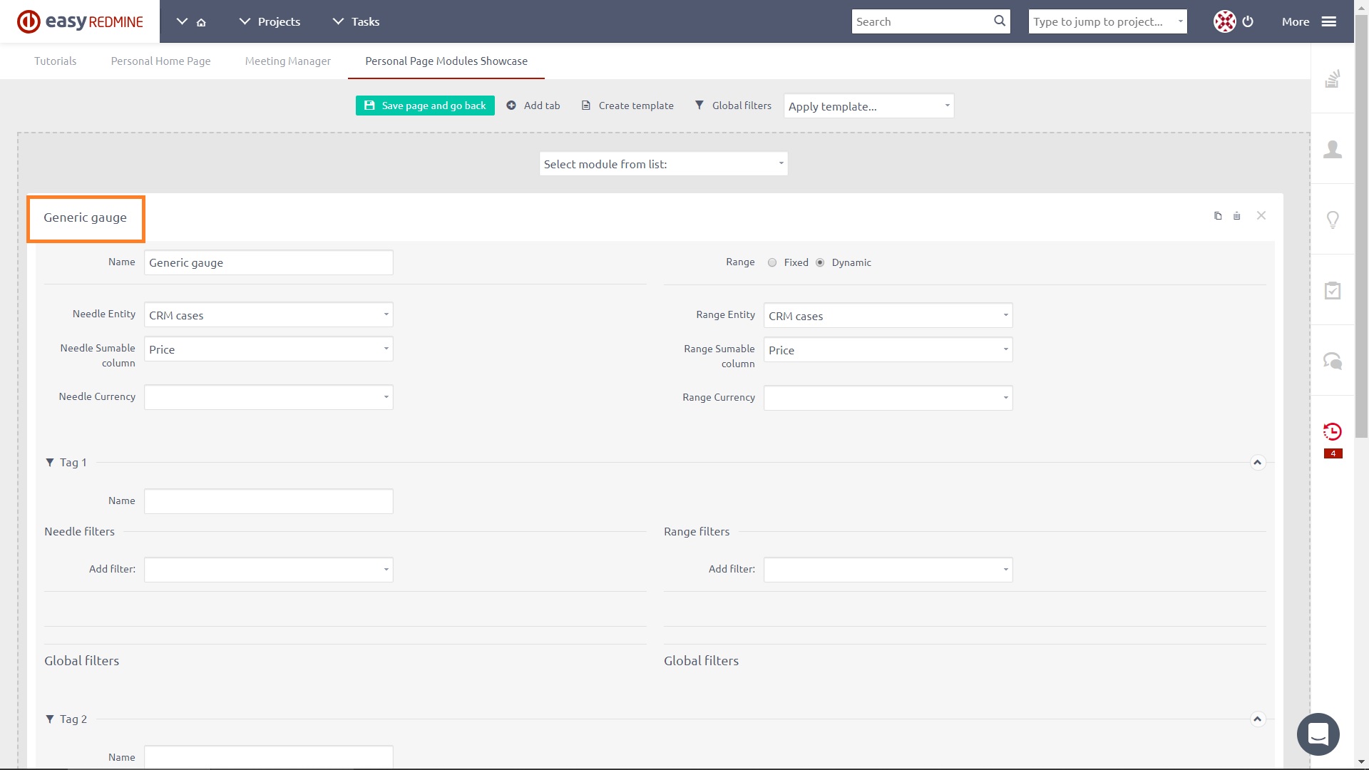
Generic gauge
Generic gauge uses needles to show information as a reading on a dial. On a gauge chart, the value for each needle is read against the colored data range, which can be configured as fixed or dynamic. This chart type is often used in executive dashboard reports to show key business indicators. Generic gauge supports up to 3 tags in order to quickly change the chart settings, such as weekly, monthly and quarterly performance, without the need to add more charts for this purpose. You can click on each tag and switch between results.
Setting options of Generic gauge
- Name: Give your gauge a name.
- Needle entity: Select the data source of the needle, such as CRM cases, tasks, spent time, etc.
- Needle summable column: Select the data category of the needle, such as price, spent time, remaning time, etc.
- Range: Select data range of the needle (fixed or dynamic). Fixed means that the range is given by the Max value you manually set. Dynamic means that the range is given by the selected range entity and range summable column. It will change anytime the value of the entity in "Range summable column" changes. For example sum of estimated time on open tasks.
- Tag #: Generic gauge may contain up to 3 tags, which basically means 3 different generic gauges in one module with the possibility to quickly switch in between like tabs in your web browser. For each tag, you may enter a different name, needle filters and range filters, while other settings are common for all the tags.
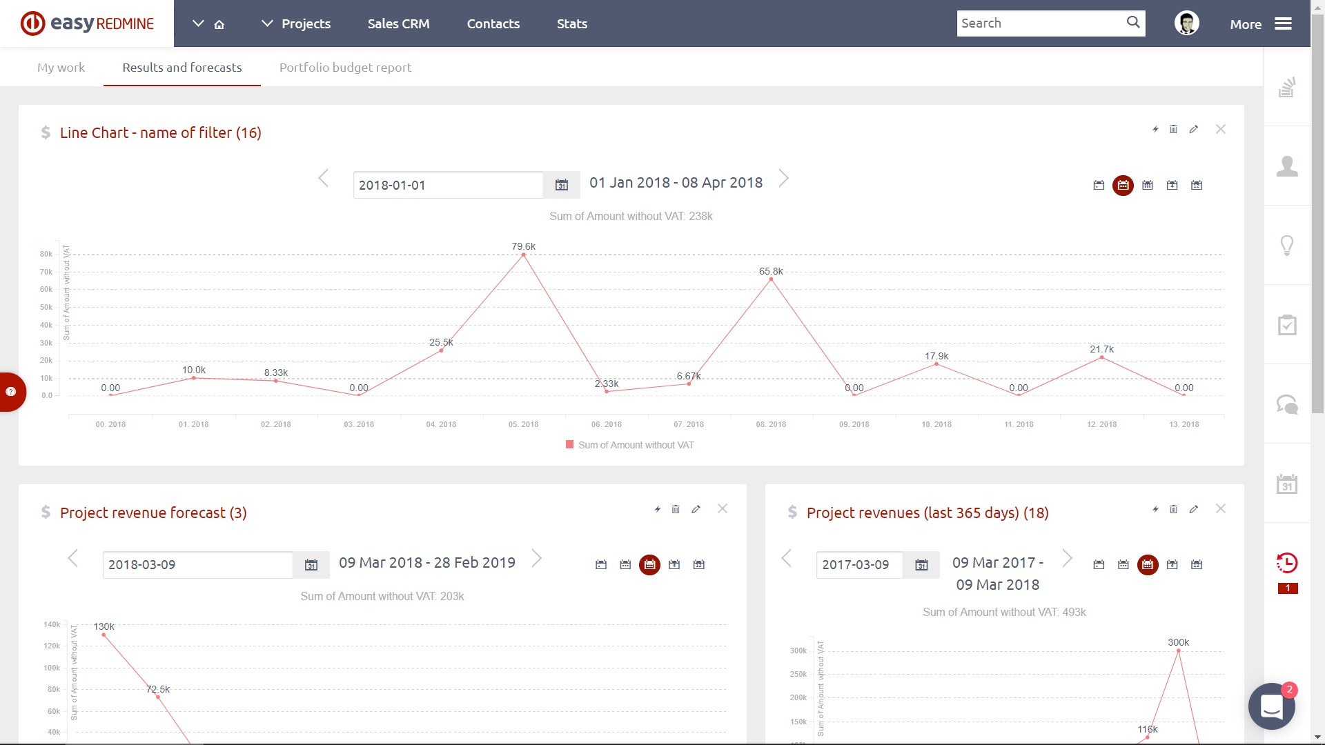
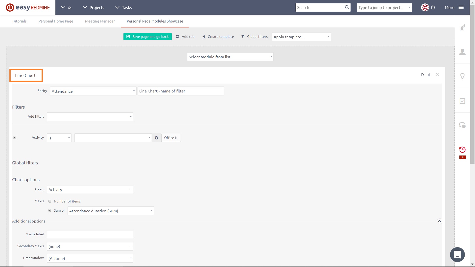
Line chart
A line chart is a type of chart which displays information as a series of data points called 'markers' connected by straight line segments. It is a basic type of chart common in many fields. It is similar to a scatter plot except that the measurement points are ordered (typically by their x-axis value) and joined with straight line segments. A line chart is often used to visualize a trend in data over intervals of time – a time series – thus the line is often drawn chronologically. In these cases, they are known as run charts. If multiple lines are shown in one line chart and some values are missing for any line, the missing values will be replaced automatically with value 0 in order to keep the lines continuous.
Setting options of Line chart
Same as Bar chart.
Pie chart
A pie chart is a circular statistical graphic which is divided into slices to illustrate numerical proportion. In a pie chart, the arc length of each slice (and consequently its central angle and area), is proportional to the quantity it represents. Pie charts are very widely used in the business world and the mass media.
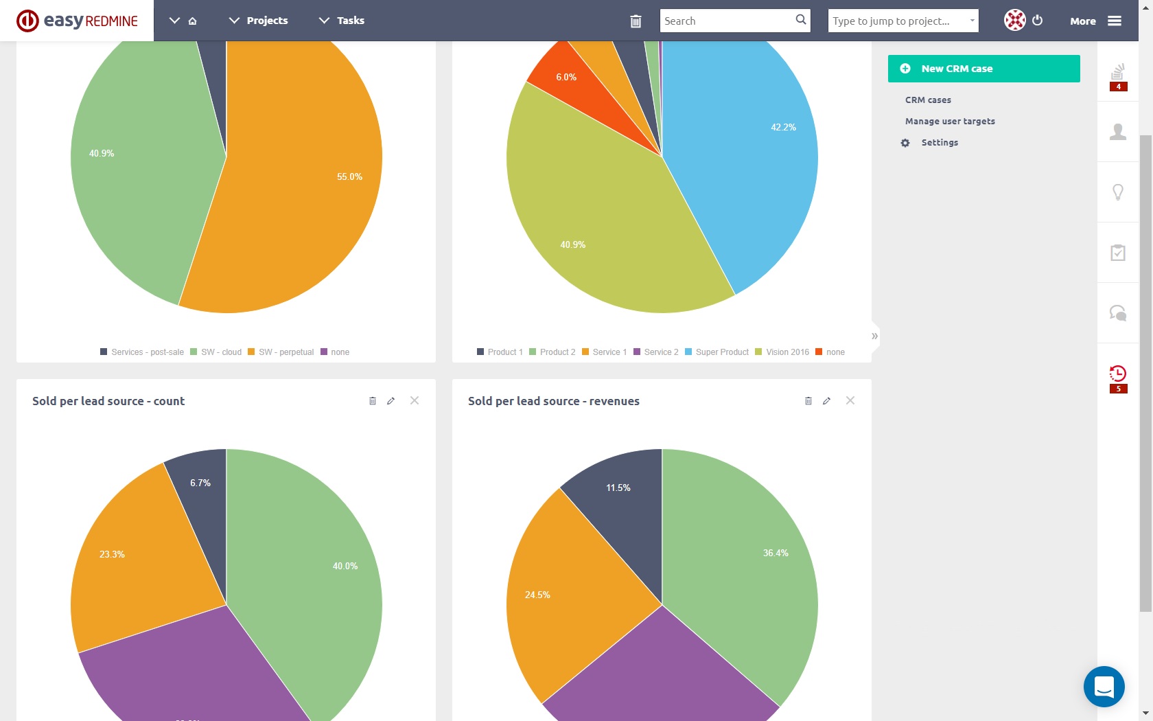
Setting options of Pie chart
Same as Bar chart.
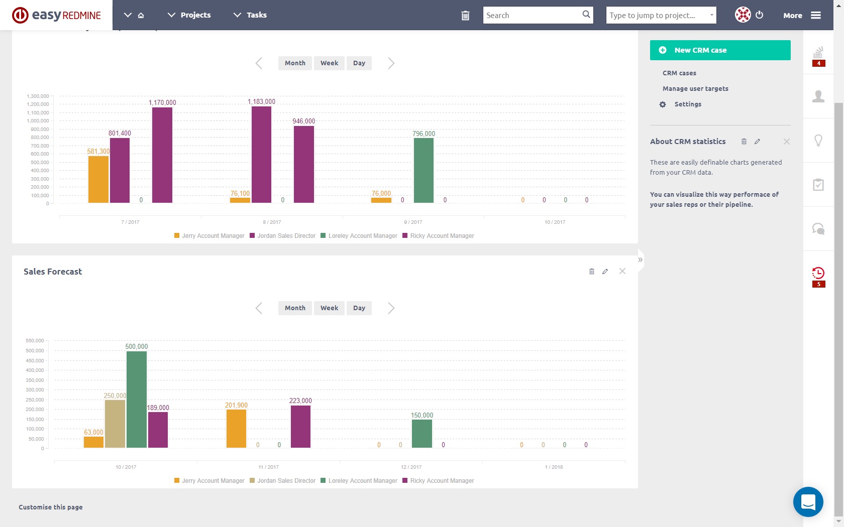
Timeseries
The best thing on timeseries is that you can view any number of various entities in one chart. For example a total performance chart, containing the sum of story points on closed tasks, project incomes by date, number of closed support tickets, amount of billable service hours, the total value of billable service hours, etc. Just think of the possibilities.
How to use:
- During dashboard customisation, find module Timeseries
- Choose the default period
- Add data series
- Choose entity (the entity must have some date attribute (for example due date in tasks, contract date in CRM cases)
- Select which date attributed will be used
- Select which value will be on the chart. You can select the number of the entities but also sum or average of a numeric attribute of the entity.
- Set filters for the entity
Here is one example.

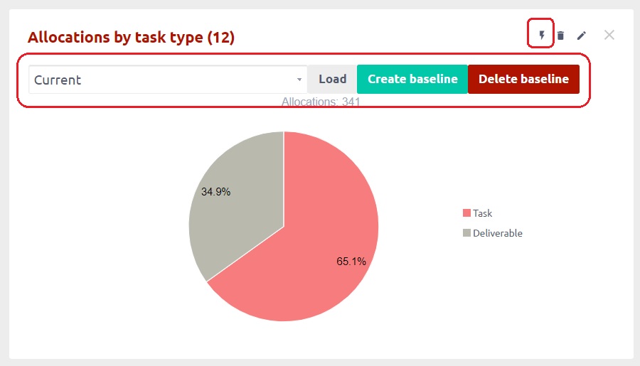
Baseline on charts
Baseline is a convenient chart-related feature for saving the continuous development (changes) on pie, bar or line charts. It is indicated by a lightning icon visible in all chart modules added to any customisable dashboard. By clicking the icon, a drop-down list of existing baselines appears together with two buttons. To create a new baseline, click on the "Create baseline" button and refresh the page to make it appear in the list. To load an existing baseline, just select one from the list and click the "Load" button. To delete a baseline, click the Delete button next to the Create button.